

Brand Identity · Editorial Design · Illustration System
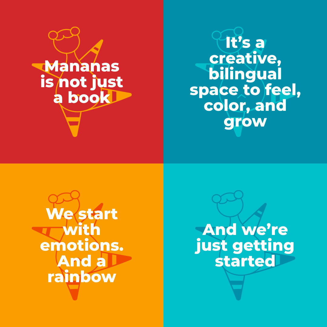
A bilingual brand built from the ground up. From concept and naming, through character design and editorial illustration, to a published collection of children’s books available globally.
Where it started
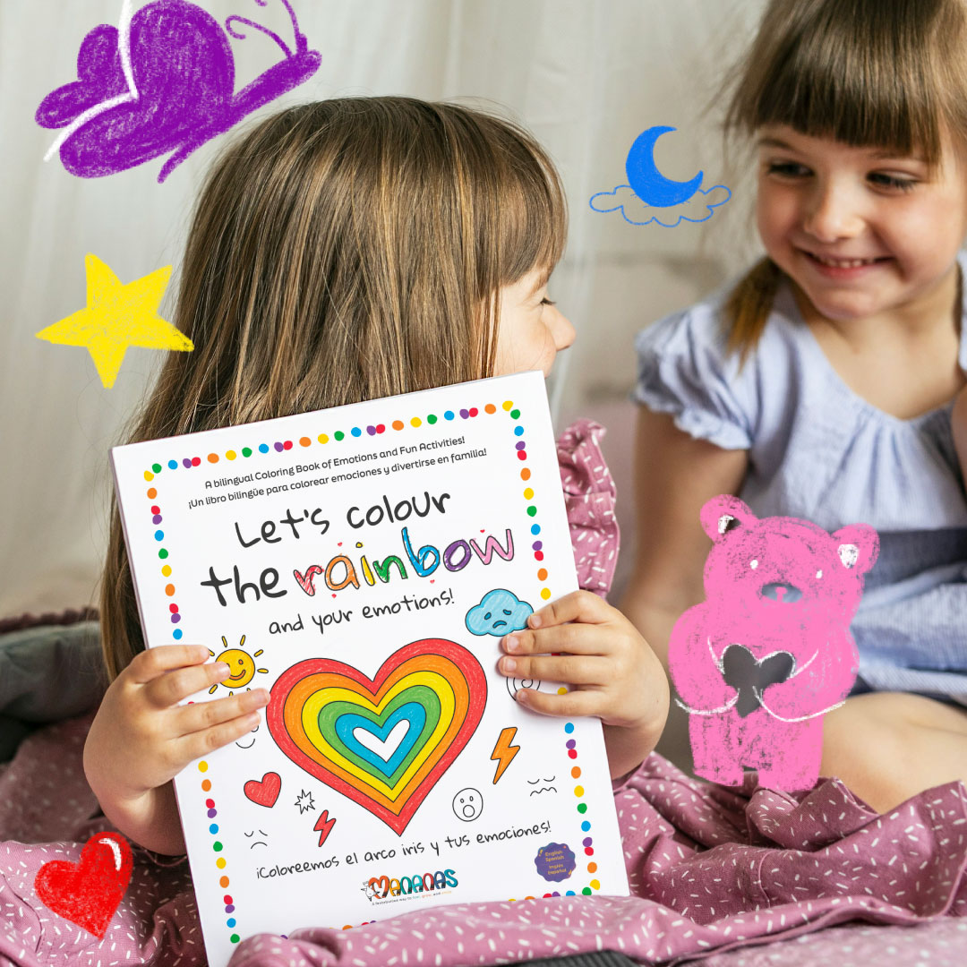
Mananas grew out of a simple but urgent question: how do we help children understand their emotions before they have the words for them?
The answer became a brand. And then a book. And then a collection.
My role was to build everything from scratch — the name, the identity, the character, the illustration system, the editorial design, and the product strategy that would carry it all forward.
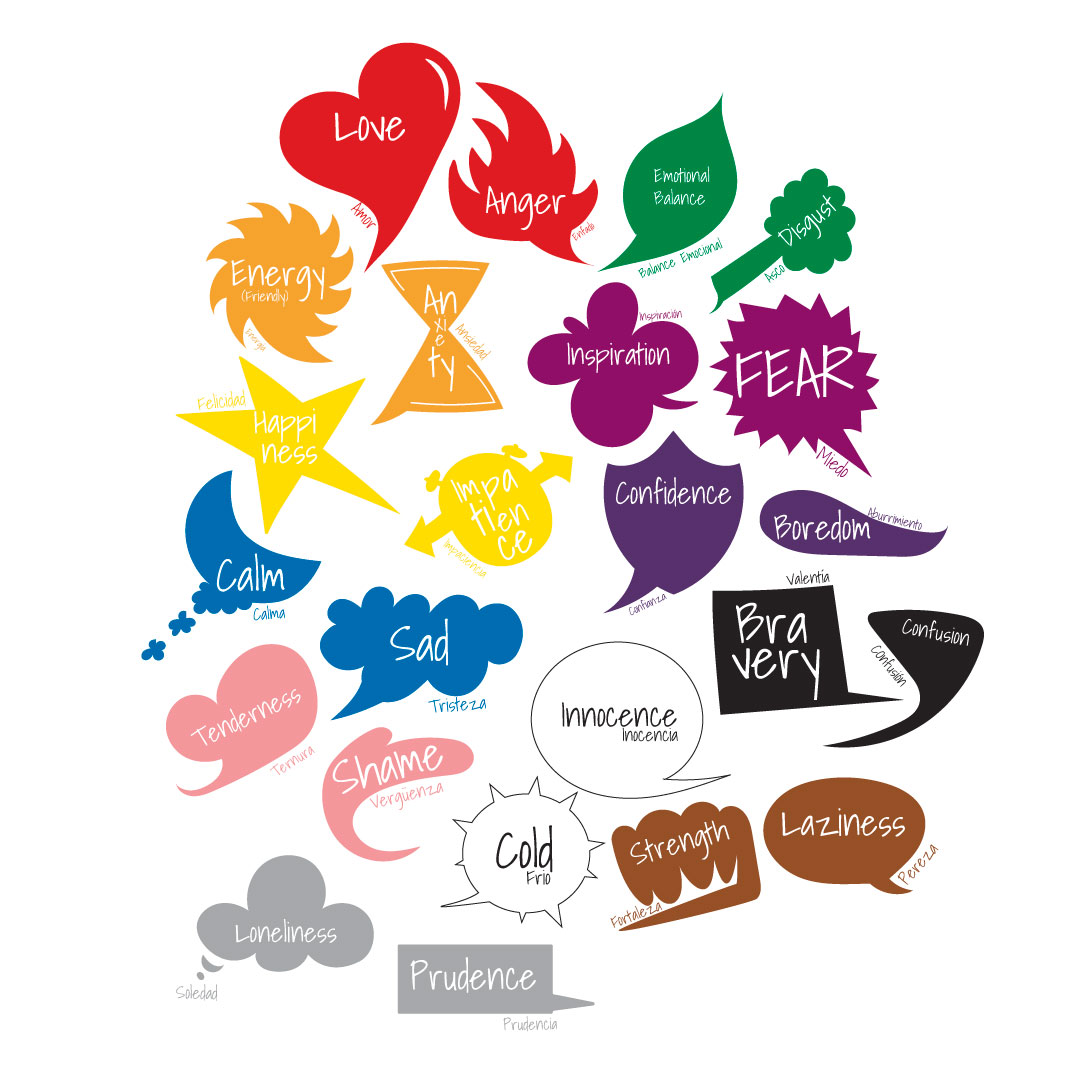
Every color tells a story. Every emotion matters.
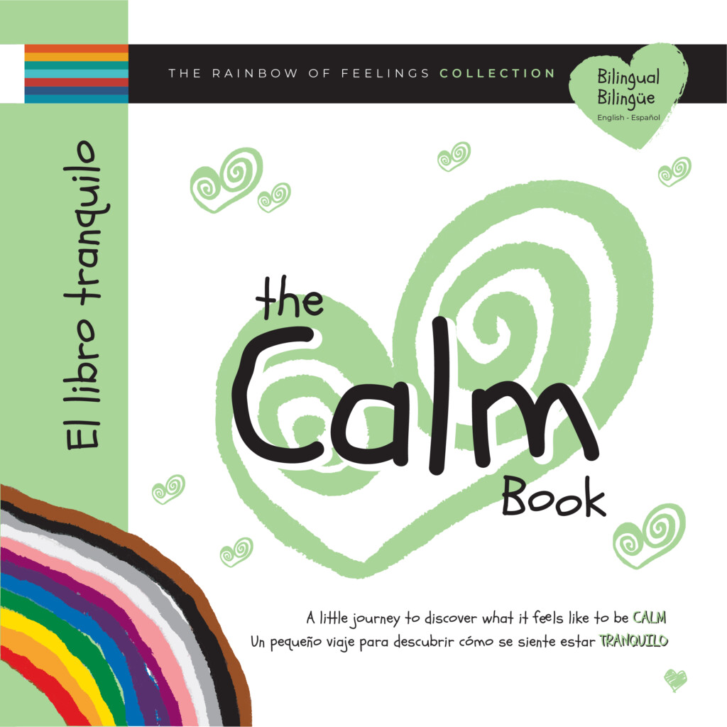
Building the identity
The name Mananas is a bilingual play on words — warm, a little whimsical, and designed to feel at home in both English and Spanish-speaking worlds. That sense of belonging in two languages at once became the foundation for every creative decision that followed.
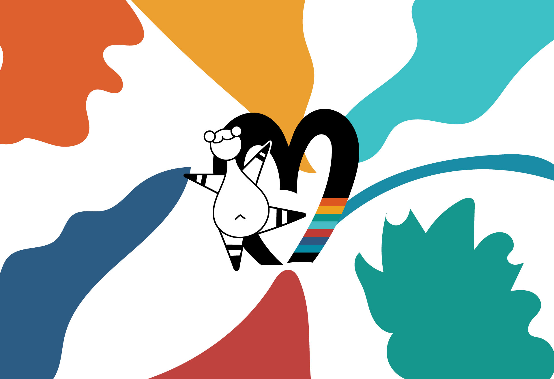
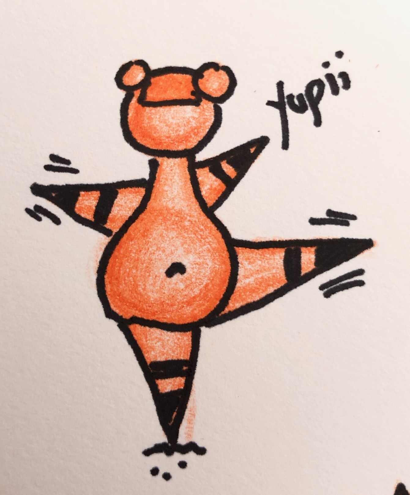
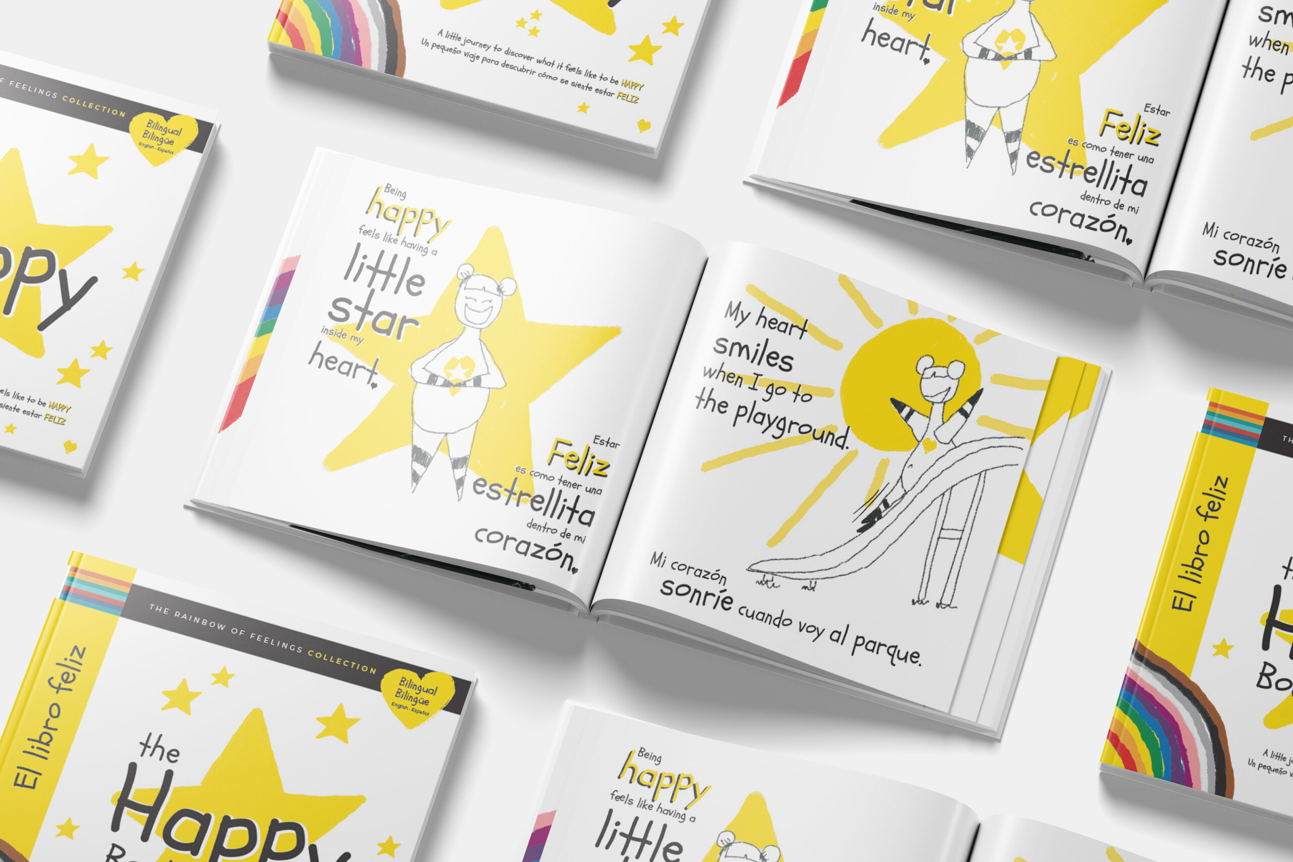
The Character
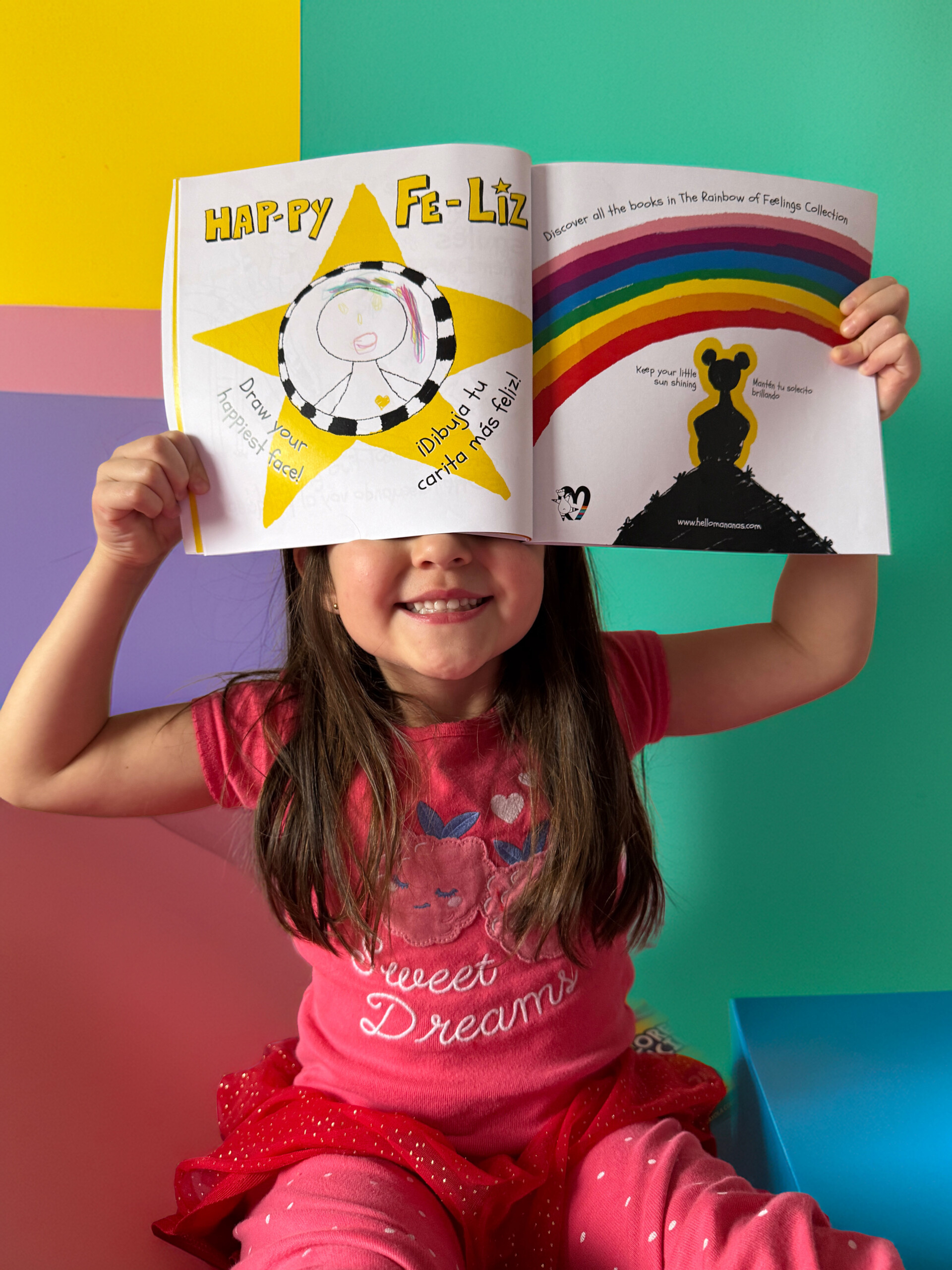
A genderless, expressive figure that always carries a heart. The character appears in every book, adapting its posture, expression, and color to match whatever feeling it is holding — while always staying recognizably itself.
01The Visual Logic
The illustration style is deliberately hand-drawn and intentionally imperfect. Lines are loose. Colors bleed slightly outside the shapes. That imperfection is a design decision — it gives children permission to feel messy, to not have everything figured out.
02Every emotion has its own world
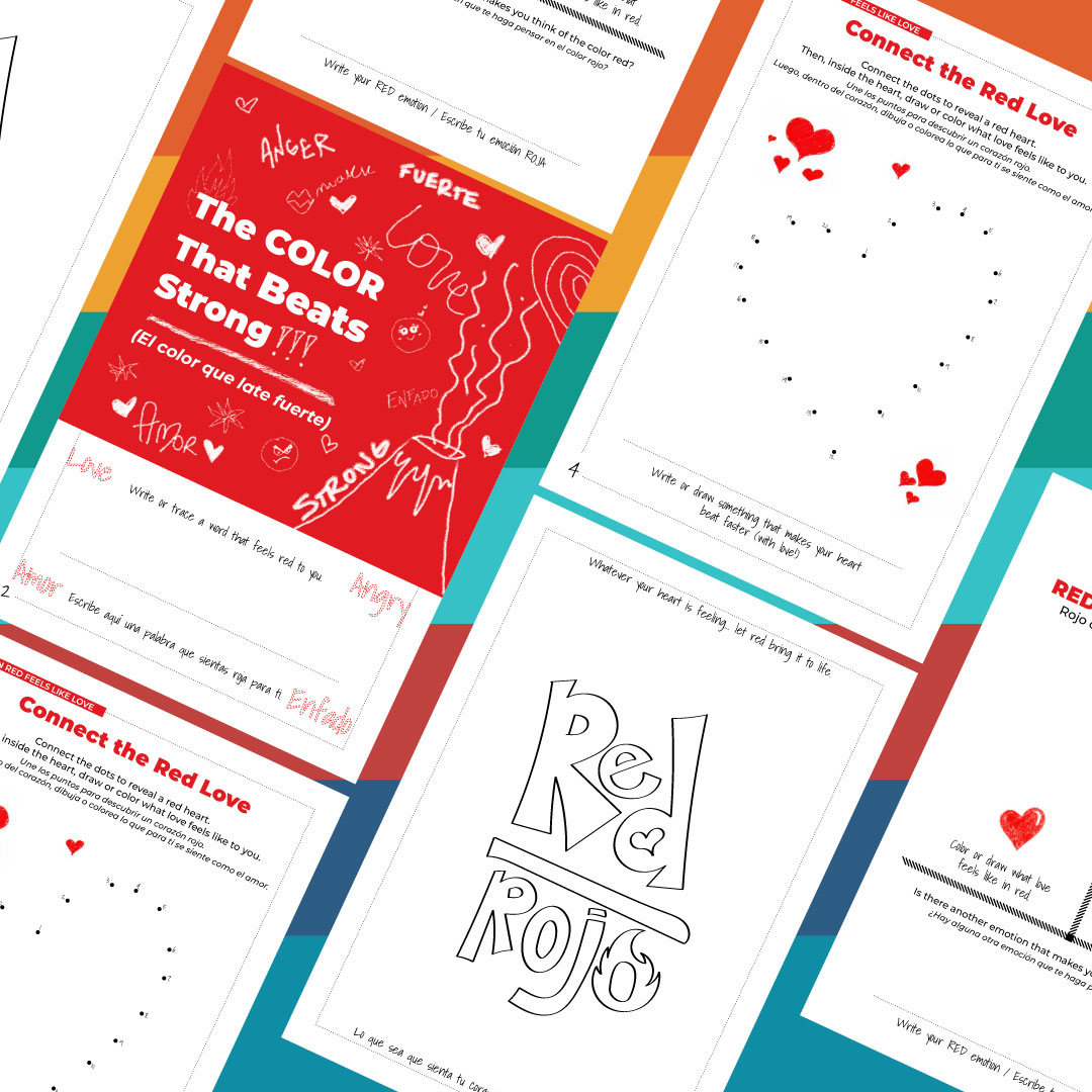
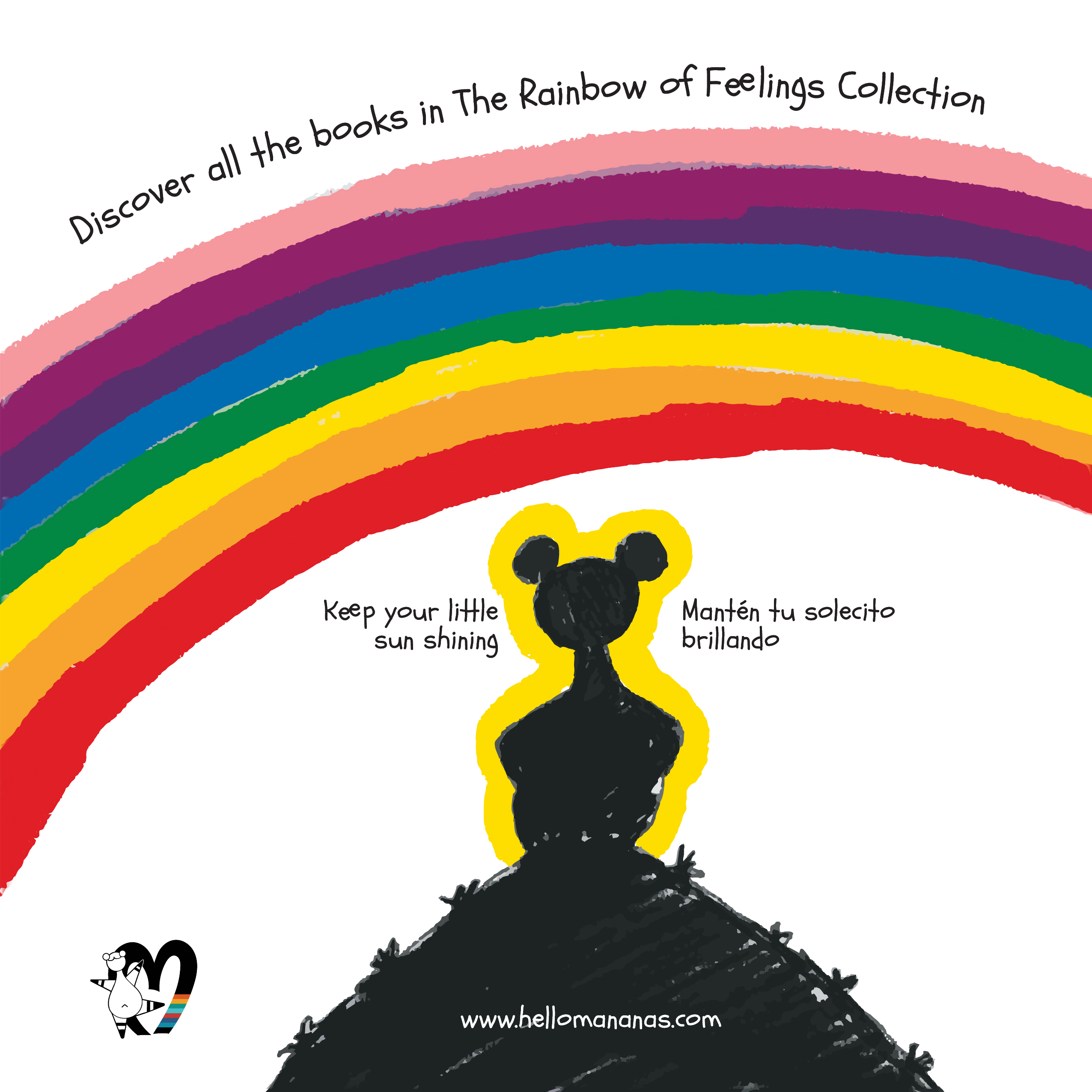
Color is where the system really comes alive. Each emotion in the collection has its own color, its own shape language, its own typographic texture. The logic is simple enough for a child to understand and flexible enough to keep growing — eventually completing a full rainbow of feelings.
Built to scale
Every element was designed for scalability from day one — the character, the color logic, the typographic hierarchy, the bilingual layout system. The brand can grow in any direction without losing its voice or its visual coherence.
Bilingual by design
English and Spanish are always treated with equal visual weight. Neither language is smaller, lighter, or secondary.
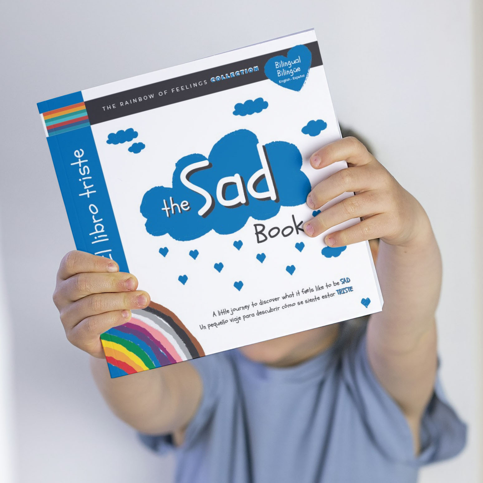
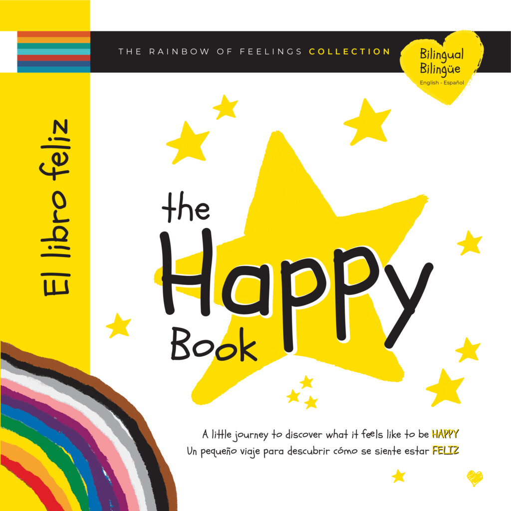
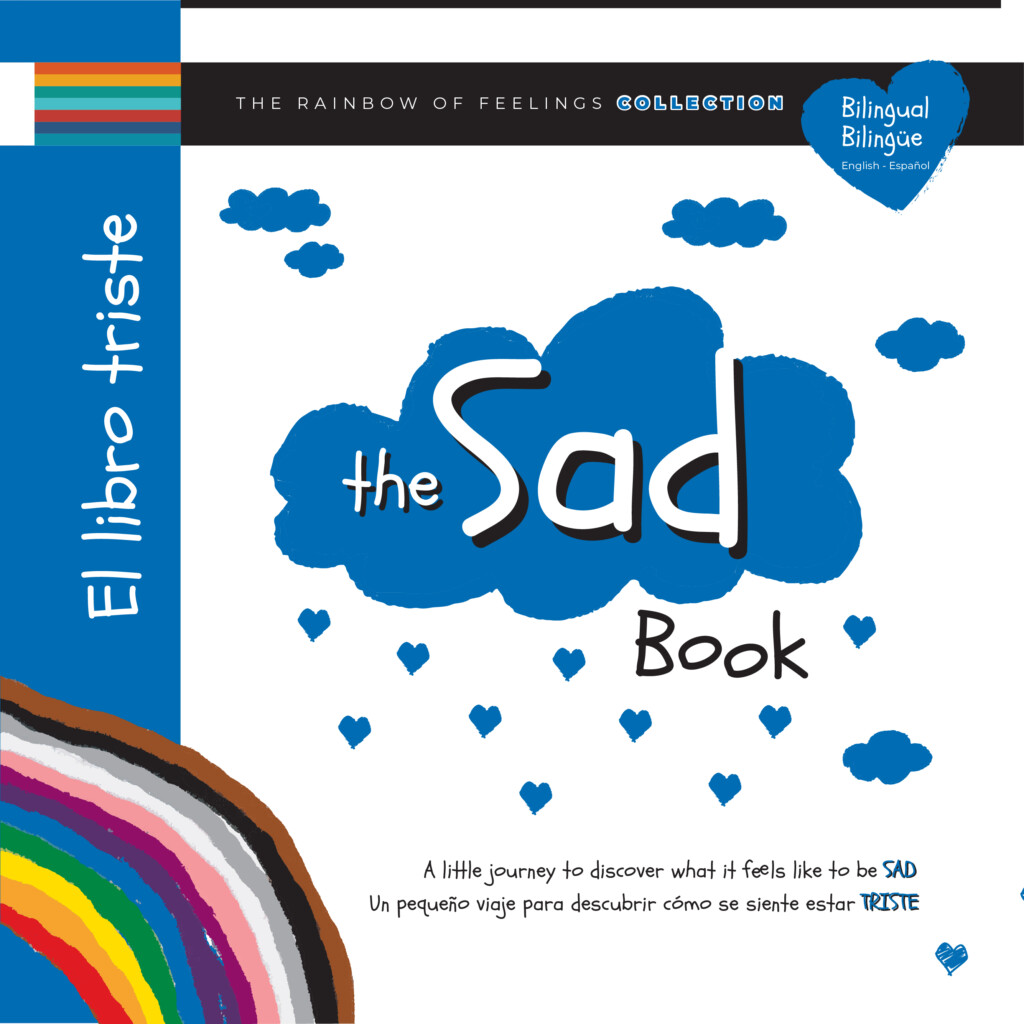
Consistent framework
Every book follows the same architecture — color-coded cover, character in that emotion’s palette, interactive closing page — making the system immediately recognizable as a collection.
Expandable color logic
Happy, Sad, and Calm are the first three colors of the rainbow. The remaining emotions and their colors are already mapped and ready.
Emotion Color Palette
The full rainbow — coming soon